

A mega menu allows you to show several menus from one dropdown in your store’s main navigation. In other words, it displays all of your products and collections, allowing customers to easily navigate through your store. How to add a mega menu to Shopify is a question every merchant concerns about.
However, before you dig in any further guide, be affirmed that the mega menu is necessary in your own case. If a mega menu is surely your buddy, let’s see how you can add it.
The easiest way is to install an application from the Shopify app store. However, to choose the right app, make sure you check our mega menu apps review to know which one suits your business the best.
Though, the truth is that creating a mega menu in Shopify isn’t as hard as you think. In this tutorial, we’ll help you go through the steps to set up a mega menu without any app.
Creating a mega menu in Shopify
Step 1: Define mega menu structure
In order to create a mega menu in Shopify, first, you need to define your store menu structure. To do this, create a dropdown from the main menu. You need to set up a three-level structure to properly use the mega menu. The following instructions will show you how:
- From your Shopify admin, go to Online Store > Navigation > Main menu
- Now choose the menu item you want to put the mega menu in. In this case, we’ll go with the Catalog.
- Create sub-menu items by clicking Add menu item at the bottom. Then, drag and drop them under Catalog.

Notice:
If you make changes to your original code, you can’t revert back. Therefore, we suggest you duplicate your theme first and work on the duplicate. In that way, you can go back to your previous version at any time.
To duplicate, simply go to your Online Store > Themes > Actions > Duplicate.
Step 2: Edit section header.liquid
From your Shopify admin, go to Online Store > Themes > Actions > Edit code.

Then, in the Section directory, open file header.liquid.
Afterwards, scroll to the bottom, copy this code next to the ] and click Save.
,
"blocks": [
{
"type": "logo_image",
"name": "Mega logo",
"settings": [
{
"type": "checkbox",
"id": "menu_enable",
"label": "Enable this section",
"default": true
},
{
"type": "image_picker",
"id": "image",
"label": "Image"
},
{
"type": "text",
"id": "mega_link",
"label": "Select menu",
"default": "1"
},
{
"type": "url",
"id": "link",
"label": "Main Link"
},
{
"type": "text",
"id": "title",
"label": "Title"
},
{
"type": "text",
"id": "subtitle",
"label": "Sub title"
}
]
}
]
Step 3: Edit file site-nav.liquid
Firstly, in the Snippets directory, open file site-nav.liquid.
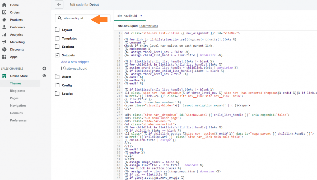
Then, remove all the old code, replace with this code and click Save.
<ul class="site-nav list--inline {{ nav_alignment }}" id="SiteNav">

{% for link in linklists[section.settings.main_linklist].links %}
{% comment %}
Check if third-level nav exists on each parent link.
{% endcomment %}
{%- assign three_level_nav = false -%}
{%- assign child_list_handle = link.title | handleize -%}

{% if linklists[child_list_handle].links != blank %}
{% for childlink in linklists[child_list_handle].links %}
{% assign grand_child_list_handle = childlink.title | handleize %}
{% if linklists[grand_child_list_handle].links != blank %}
{%- assign three_level_nav = true -%}
{% endif %}
{% endfor %}
{% endif %}

{% if linklists[child_list_handle].links != blank %}
<li class="site-nav--has-dropdown{% if three_level_nav %} site-nav--has-centered-dropdown{% endif %}{% if link.active %} site-nav--active{% endif %}" aria-has-popup="true" aria-controls="SiteNavLabel-{{ child_list_handle }}">
<a href="{{ link.url }}" class="site-nav__link site-nav__link--main">
{{ link.title }}
{% include 'icon-chevron-down' %}
<span class="visually-hidden">{{ 'layout.navigation.expand' | t }}</span>
</a>

<div class="site-nav__dropdown" id="SiteNavLabel-{{ child_list_handle }}" aria-expanded="false">
<div class="sub-menu-inner-page">
<div class="side-bar-menu">
<ul class="sidebar-menu-list">
{% for childlink in linklists[child_list_handle].links %}
{% if childlink.links == blank %}
<li class="{% if childlink.active %}site-nav--active{% endif %}" data-id="mega-parent-{{ childlink.handle }}">
<a href="{{ childlink.url }}" class="site-nav__link main-bold-title">
{{ childlink.title | escape }}
</a>
</li>
{% endif %}
{% endfor %}
</ul>
</div>
{% assign image_block = false %}
{% assign linktitle = link.title | downcase %}
{% for block in section.blocks %}
{%- assign val = block.settings.mega_link | downcase -%}
{% if val == linktitle %}
{% if block.settings.menu_enable %}
{% assign image_block = true %}
{% endif %}
{% endif %}
{% endfor %}
<div class="middle-menu {% if image_block == false %}middle-menu-full{% endif %}">
{% for childlink in linklists[child_list_handle].links %}
{% if childlink.links != blank %}
{% for grandlink in childlink.links %}
{% assign valitem = forloop.length %}
{% endfor %}
<ul class="middle-menu-list {% if valitem >= 15 %}col-2{%endif%}">
<p class="" data-id="mega-parent-{{ childlink.handle }}">
<span class="site-nav__link main-bold-title">
{{ childlink.title | escape }}
</span>
</p>
{% assign item_count = 1 %}
{% for grandlink in childlink.links %}
<li class="site-nav__childlist-item">
<a href="{{ grandlink.url }}" class="site-nav__child-link" >
{{ grandlink.title }}
</a>
</li>
{% endfor %}
</ul>
{% endif %}
{% endfor %}

</div>
{% if image_block == true %}
<div class="image-section mega-list mega-list-logo">
{% for block in section.blocks %}
{%- assign val = block.settings.mega_link | handleize -%}
{% if val == child_list_handle %}
{% if block.settings.menu_enable %}
{% unless block.settings.link == blank %}<a href="{{ block.settings.link }}">{% endunless %}
<div class="img-box">
<img src="{{ block.settings.image | img_url: '500x500' }}">
<div class="text__section">
{% unless block.settings.title == blank %}<h3>{{ block.settings.title }}</h3>{% endunless %}
{% unless block.settings.subtitle == blank %}<p>{{ block.settings.subtitle }}</p>{% endunless %}
</div>
</div>
{% unless block.settings.link == blank %}</a>{% endunless %}
{% endif %}
{% endif %}
{% endfor %}
</div>
{% endif %}
</div>
</div>
</li>
{% else %}
<li {% if link.active %}class="site-nav--active"{% endif %}>
<a href="{{ link.url }}" class="site-nav__link site-nav__link--main">{{ link.title }}</a>
</li>
{% endif %}

{% endfor %}
</ul>
Step 4: Add CSS + JS
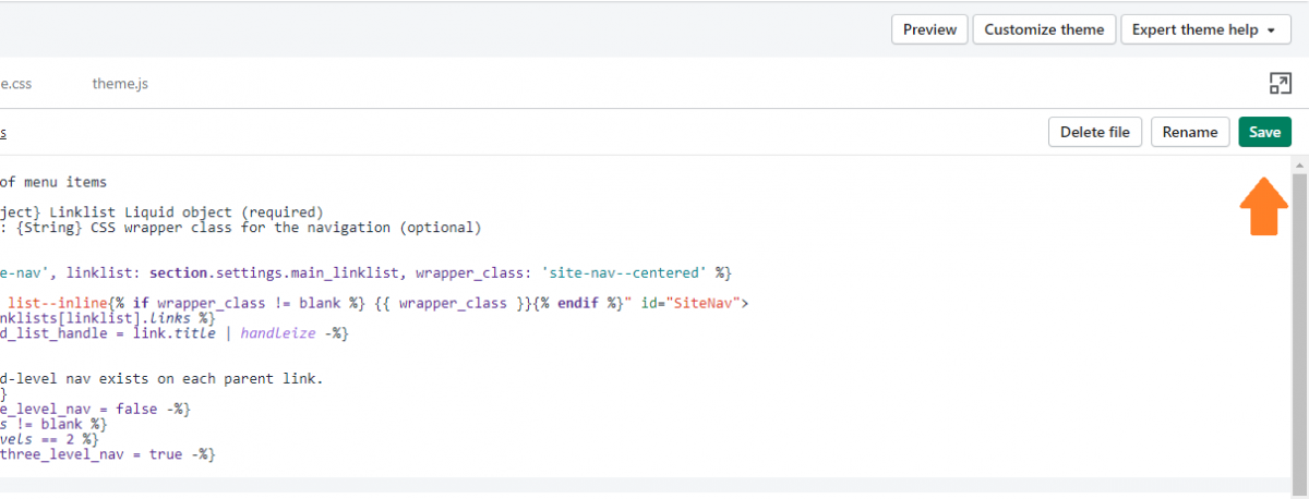
Open theme.scss.liquid file in the Assets directory, copy the following code at the end of the file:
.site-nav, .site-nav--has-dropdown, .site-header {
position: unset;
}
.site-nav__dropdown {
width: 100%;
left: 0;
right: 0;
background-color: #fff;
}
.site-nav__childlist {
display: block;
}
.site-nav__dropdown .side-bar-menu{
float: left;
text-align: left;
padding-top: 25px;
padding-right: 30px;
padding-bottom: 25px;
width: 150px;
padding-right: 10px;
}
.site-nav__dropdown .side-bar-menu .sidebar-menu-list li a{
text-transform: uppercase;
font-weight: bold;
padding: 0 20px 10px 0;
font-size: 13px;
}
.site-nav__dropdown .middle-menu{
float: left;
padding-top: 25px;
padding-bottom: 25px;
padding-left: 10px;
padding-right: 10px;
width: calc(100% - 370px);
position: relative;
display: flex;
}
.site-nav__dropdown .middle-menu .middle-menu-list{
width: 20%;
float: left;
text-align: left;
position: relative;
padding-top: 27px;
}
.site-nav__dropdown .middle-menu .middle-menu-list p{
position: absolute;
top: 0;
margin-bottom: 0;
width: 100%;
}
.site-nav__dropdown .middle-menu .middle-menu-list span.main-bold-title{
font-size: 13px;
font-weight: bold;
padding: 0 20px 10px 0px;
text-transform: uppercase;
display: block;
color: #000;
}
.site-nav__dropdown .middle-menu .middle-menu-list a.site-nav__child-link{
text-transform: capitalize;
padding: 0 20px 10px 0px;
font-size: 13px;
font-weight: 300;
}
.site-nav__dropdown .image-section{
float: left;
padding-top: 25px;
padding-bottom: 25px;
position: relative;
width: 220px;
height: 100%;
}
.site-nav__dropdown .image-section .img-box{
position: relative;
}
.site-nav__dropdown .image-section .text__section{
position: absolute;
top: 50%;
left: 50%;
width: 90%;
transform: translate(-50%,-50%);
color: white;
}
.site-nav__dropdown .image-section .text__section h3{
font-size: 14px;
text-transform: uppercase;
color: white;
margin-bottom: 5px;
}
.site-nav__dropdown .image-section .text__section p{
font-size: 13px;
text-transform: inherit;
color: white;
font-weight: normal;
}
.site-nav__dropdown .sub-menu-inner-page{
max-width: $width-site;
display: block;
margin: 0 auto;
padding: 0 55px;
overflow: auto;
}
.site-header .grid--table>.grid__item {
vertical-align: bottom;
}
.site-nav {
margin: 0;
}
.site-nav > li {
padding: 20px 0;
}
.site-nav--active-dropdown .site-nav__dropdown {
display: block !important;
}
.img-box .text__section h3,
.img-box .text__section p {
text-align: center;
}
.mega-list-logo a {
padding: 0;
}
.site-nav--has-dropdown:hover .site-nav__dropdown{ display: block !important; }
Then, open theme.js file from the Assets directory.
Afterwards, find theme.Header
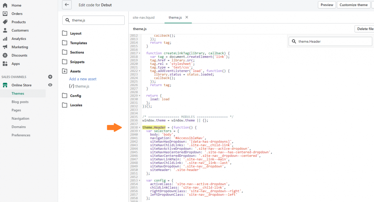
At last, replace function init() with the following code and hit Save.
function init() {
  cacheSelectors();
  $(selectors.siteNavHasDropdown).on('mouseenter', function() {
    	var $el = $(this);
  	showDropdown($el);
  });
  $('.site-nav__dropdown').on('mouseenter', function() {
  	$(this).show();
    	$(this).parent().addClass(config.activeClass);
  });
  $(selectors.siteNavHasDropdown).on('mouseleave', function() {
  	hideDropdown(cache.$activeDropdown);
  });
  $('.site-nav__dropdown').on('mouseleave', function() {
    	hideDropdown(cache.$activeDropdown);
    	$(this).hide();
  });
  cache.$subMenuLinks.on('click.siteNav', function(evt) {
    // Prevent click on body from firing instead of link
    evt.stopImmediatePropagation();
  });
}
function showDropdown($el) {
$el.addClass(config.activeClass);
var headerHeight = $('#shopify-section-header').outerHeight(),
headerNav = $el.find('.site-nav__dropdown').outerHeight();
$el.find('.site-nav__dropdown').css({top: +headerHeight+ 'px'});
cache.$activeDropdown = $el;
}
function hideDropdown($el) {
// remove aria on open dropdown
$el.removeClass(config.activeClass);
// reset active dropdown
cache.$activeDropdown = $(selectors.siteNavActiveDropdown);
$(selectors.body).off('click.siteNav');
$(window).off('keyup.siteNav');
}Step 5: Add an image for mega menu

From your Shopify admin, go to Online Store > Themes > Customize
Click Header on the left side of the screen, then scroll to the bottom, click Add mega logo.
Afterwards, you can add an image to your mega menu dropdown by selecting the image in the setting Featured Image. Additionally, you can link this image to a collection or product, etc… as you wish by selecting a link in the setting Slide link.
Finally, save your changes to make sure you won’t lose all your progress.
The result
Refresh your online store then you’ll see the Shopify dropdown menu hovering over. Now, we hope you should know how to add a mega menu in the Shopify store by yourself.
Besides the mega menu, there are a lot of factors to be added to your Shopify theme such as footer menu, breadcrumb, multiple currencies, product tags, product countdown timer, etc.

If you still have some thoughts on following this tutorial or need more custom change support, don’t hesitate to get in touch with us for expert help. You can also order our adding mega menu service to save your time and have a perfect mega menu right away.